5 Best Kajabi Website Examples for Coaches & Creators (And What Makes Each One Work)
By Chrisianie Pacheco
Chrisianie Pacheco is the founder of Fav Studio, a creative studio specializing in Kajabi design, creator websites and third-party Kajabi templates.

Your Kajabi website is your brand's first handshake — and most of the time, it's happening without you in the room. No introduction, no pitch, no charm. Just a page, a visitor, and about three seconds to make them feel like they're in the right place.
The best Kajabi website examples don't just look good. They're built with a clear job to do: stop the right person, earn their trust, and guide them toward a decision. That's a strategy problem as much as a design one — and most Kajabi sites get it wrong.
Below are five real sites that get it right. Each one is different in industry, audience, and aesthetic — but all of them share the same underlying logic: intentional design in service of a very specific person. Here's what that looks like in practice.
What Separates a Great Kajabi Website from a Forgettable One
Here's something worth saying before the examples: a Kajabi website isn't a digital brochure. It's a system. And every page in that system has a role — your homepage qualifies and directs, your about page builds connection, your sales pages convert, your content builds long-term authority.
When those pieces are designed to work together — with consistent brand language, clear hierarchy, and a visitor journey that actually makes sense — the website stops being something you maintain and starts being something that works for you.
That's the standard the sites below are held to. Not "does it look nice?" but "does it work?"
1: Carrie — The Bestselling Kajabi Template That Doesn't Look Like One
What It Does Right
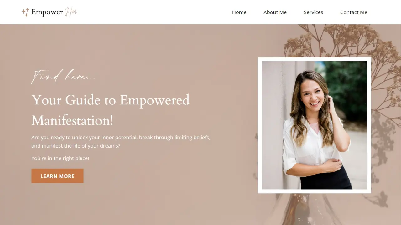
There's a version of this site that looks like every other Kajabi build — clean, functional, forgettable. Carrie's version is none of those things. Same template, completely different outcome. And the gap between the two comes down entirely to how deliberately every element has been made to feel owned rather than borrowed.
The homepage hierarchy does exactly what it should: it answers the visitor's first three questions — who is this for, what do I get, and what do I do next — before they've had a chance to wonder. The copy leads with outcome, not biography. The visuals feel curated, not stock. And the CTA isn't an afterthought — it's the natural destination of everything above it.
What Most Creators Miss Here
Templates aren't the limitation most creators think they are. The real limitation is treating a template like a finished product — dropping in your logo, swapping the colors, and calling it done. What Carrie's site shows is that the most powerful thing you can do with a template is rebuild it from the inside: rethink the copy from scratch, reconsider the flow, and make every design decision earn its place.
A great template in strategic hands will outperform a mediocre custom build every time.
2: Alphastute — A Custom Kajabi Website Built to Signal Authority Before You Say a Word
What It Does Right
This is Kajabi website design working at its most sophisticated. The structure is decisive: one clear message above the fold, one clear direction for where to go next. The typography has weight. The color system is consistent without being rigid. And the navigation doesn't give visitors too many options — it gives them the right ones.
What makes this site work isn't any single element. It's the discipline behind all of them. Every decision — from the headline hierarchy to the whitespace between sections — was made in service of one goal: making the right visitor feel like they've found exactly what they were looking for.
What Most Creators Miss Here
The instinct when building a Kajabi website is to pack the homepage. Show everything you offer. List every credential. Stack the testimonials. The logic feels sound — more proof, more persuasion.
But Alphastute does the opposite, and it's more persuasive because of it. Restraint, when it's intentional, reads as confidence. And confidence is the first thing high-value clients are looking for before they trust anyone with their time or money.
3: Online Sax Academy — Kajabi Website Inspiration for Educators in Unexpected Niches
What It Does Right
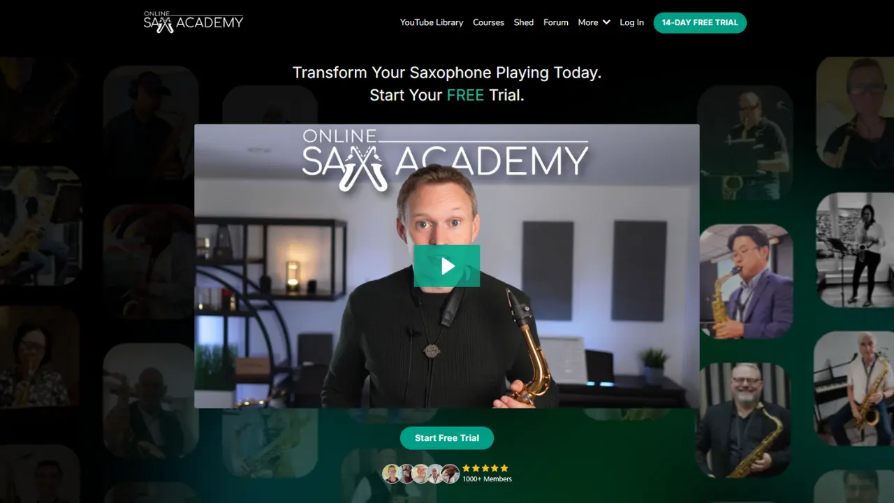
Online Sax Academy has a challenge that most education brands would rather not think about: how do you make a niche subject feel both approachable to beginners and credible to people who already know their way around a horn?
This site solves that problem without breaking a sweat. The design is warm and energetic — genuinely reflective of music as an experience, not just a subject — and it communicates enthusiasm in a way that pulls in curious newcomers without alienating serious students. The course structure is presented clearly enough that a cold visitor understands the journey and an experienced player can find where they belong in it.
There's also something rarer here: the site has personality. Not manufactured, not forced. The kind that makes you feel like you're being taught by someone who actually loves what they do. That's not a design feature. That's a brand decision that was made before anyone opened Kajabi.
What Most Creators Miss Here
Niche educators tend to over-justify. They spend so much energy convincing skeptics that their subject matters that they forget to speak directly to the people who already know it does. The result is a homepage that feels defensive instead of magnetic.
Online Sax Academy never defends itself. It just shows up fully — and trusts that the right students will recognize themselves in it. That's the posture every niche education site should have.
4: Zeus — Kajabi Website Design for Coaches Who Are Done Competing on Price
What It Does Right
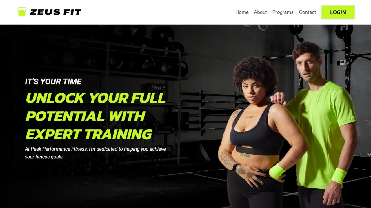
Zeus operates in a specific tier of the market — one where the website's visual language has to do significant work before the copy gets involved. And the design here is fully up to the task.
The aesthetic is editorial and intentional: dark tones, strong typographic hierarchy, a visual rhythm that moves the eye deliberately down the page. Nothing is accidental. Nothing is decorative. Every element communicates the same thing: this is a serious offer, for serious people, at a serious investment.
The site architecture supports that positioning perfectly. Visitors are walked through a clear sequence — establish authority, build desire, present the offer — and by the time the CTA arrives, it doesn't feel like a pitch. It feels like a logical next step.
What Most Creators Miss Here
There's a painful irony that plays out constantly in the premium coaching space: coaches who charge — or want to charge — at the high end of the market, running websites that visually signal the middle of it. The price becomes a surprise, a friction point, something that has to be explained rather than felt as natural.
Zeus eliminates that entirely. The price isn't the first shock. The design is — in the best possible way. By the time a visitor reaches the offer, the investment feels appropriate because the entire experience leading up to it has been telling them exactly what category this belongs in.
5: Bella — What Kajabi Sites for Creators Look Like When Brand and Business Are Fully Aligned
What It Does Right
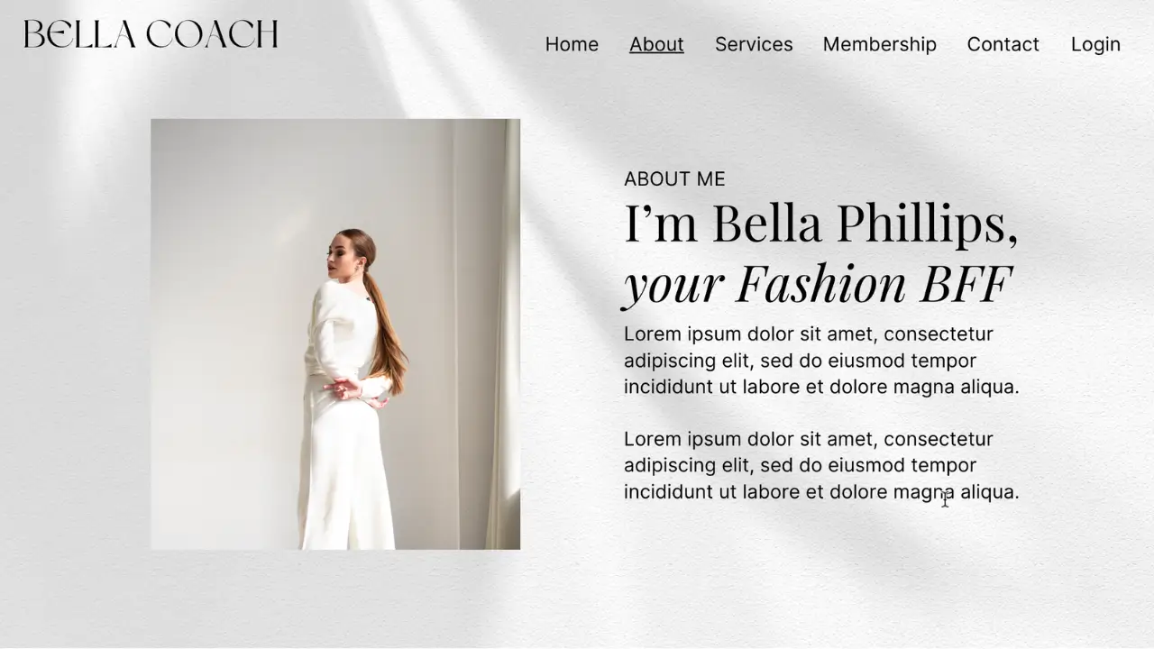
Bella's site does something that's genuinely difficult to pull off: it feels personal without feeling casual, and polished without feeling cold. That balance — warmth and professionalism existing in the same space — is the hallmark of a personal brand website that actually converts.
The design is a direct extension of the person behind it. The color palette, the photography style, the copy voice — none of it feels like it was chosen from a mood board. It feels like it was lived in. And for lifestyle and wellness creators, that sense of authenticity isn't a nice-to-have. It's the entire value proposition.
The homepage moves through a natural narrative arc — from introduction to story to offer to proof — that feels less like a sales funnel and more like a genuine conversation with someone you immediately want to learn from.
What Most Creators Miss Here
Personal brand websites fail in one of two directions. They go so polished that the person disappears behind the brand — and the audience, who came specifically for that person, can't find them. Or they go so personal that the business gets lost — and the visitor, who was ready to buy, can't figure out how.
Bella's site walks that line with clarity. The person is present. The business is clear. And the visitor always knows what to do next. That's not a styling choice — it's a strategic one.
The Through-Line Across Every Great Kajabi Website
Five different brands. Five different industries. Five completely different visual identities. And yet the same core decisions show up in all of them — because great websites, regardless of niche, are built on the same strategic foundations.
- The above-the-fold section does real work. Every site here communicates who it's for and what it offers before the visitor has to scroll. No mystery, no hunting, no guessing.
- The design earns trust before the copy does. Visual quality is a credibility signal. These sites understand that the aesthetic sets an expectation — and then the copy confirms it.
- The visitor journey is guided, not scattered. None of these homepages throw everything at once. They lead visitors through a deliberate sequence that builds toward a decision.
- The voice is specific. Every site in this list sounds like someone. Not a brand committee. Not a template. A specific person or team with a clear point of view — and that specificity is magnetic.
- The offer is impossible to miss. Clear navigation, obvious CTAs, and no ambiguity about what the next step is. Clarity is a conversion strategy.
FAQ: Kajabi Website Design and Examples
What Are the Best Kajabi Website Examples for Coaches?
The strongest Kajabi website examples for coaches prioritize authority positioning over aesthetics. Sites like Alphastute and Zeus show what that looks like in practice — clear messaging, deliberate design, and a visitor journey that builds trust before it ever asks for a commitment. The common thread isn't a particular style. It's strategic intention behind every element.
Can You Build a Fully Custom Website on Kajabi?
Absolutely — and when it's done well, you genuinely cannot tell it started as a Kajabi build. Alphastute and Online Sax Academy are both fully custom Kajabi website design projects that look and feel like bespoke brand experiences. The platform provides the infrastructure; the strategy and design are what make it distinctive.
What Makes Kajabi Website Design Strategically Different?
Kajabi connects your website directly to your courses, email sequences, sales funnels, and checkout flow — which means Kajabi website design isn't purely a visual exercise. Every design decision affects how visitors move through your entire ecosystem. That level of interconnection requires a different kind of thinking: not just "how does this look?" but "how does this work with everything else?"
Where Do I Find Kajabi Website Inspiration That's Actually Useful?
The most actionable Kajabi website inspiration rarely comes from direct competitors. Look sideways — at brands in adjacent spaces that share your audience's values. Study what makes you feel something when you land on a page, then reverse-engineer why. Is it the headline? The pacing of the scroll? Photography? That analysis is worth more than any swipe file.
Do I Need a Designer to Build a Kajabi Website That Converts?
Strategy is non-negotiable — design is the layer on top of it. If your positioning is clear, your offer is specific, and you understand your visitor's journey, a well-built Kajabi template can perform beautifully. If you want something custom — built with brand architecture, conversion strategy, and design that reflects exactly where you're positioned in your market — that's the work Fav Studio does.
Your Kajabi Website Should Be Doing More Than Existing
The five sites in this breakdown aren't successful because they found the right template or picked the right colors. They're successful because someone made a decision — before a single pixel was placed — about who the site was for, what it needed to say, and what it needed to make them do.
That's the work that happens before design. And it's the work that makes design worth doing.
At Fav Studio, we build Kajabi websites and complete digital systems for creators, coaches, and brands who are ready for their online presence to pull its weight. Custom design, conversion strategy, and brand architecture — built as a system, not a collection of pages.
If your current site is just existing, it's time to build one that works. Book a strategy session to build a Kajabi website your audience can't ignore.