7 Kajabi Landing Page Examples That Actually Convert (Breakdown + Strategy)
By Chrisianie Pacheco
Chrisianie Pacheco is the founder of Fav Studio, a creative studio specializing in Kajabi design, creator websites and third-party Kajabi templates.
You built the course. You set up Kajabi. You hit publish — and then waited for sales that didn't come. Sound familiar?
Here's the uncomfortable truth most platform tutorials skip: Kajabi doesn't sell your offer. Your landing page does. And the difference between a page that converts and one that just sits there is rarely the platform, the price point, or even the product. It's the strategy — or the lack of it — baked into how the page was built.
We've analyzed some of the most effective kajabi landing page examples across industries — online courses, coaching academies, beauty brands, corporate events, retreats, and more — and what separates the ones that convert isn't a fancy design or a longer page. It's a specific, intentional architecture built around one person's decision to say yes.
Here's what that looks like in practice.
Why Most Kajabi Landing Pages Underperform (And What to Do Instead)
Before the examples, you need this frame — because without it, you'll look at these pages and only see the aesthetics.
A high-converting Kajabi landing page does three things in the first seven seconds: it stops the scroll, it speaks to a specific person, and it makes the next step feel inevitable. Not pushy. Not clever. Just clear.
Most pages fail at step two. They're written for everyone, which means they resonate with no one. The moment a visitor lands and thinks "is this for me?" — you've already lost them.
The pages in this breakdown don't have that problem. Here's why.
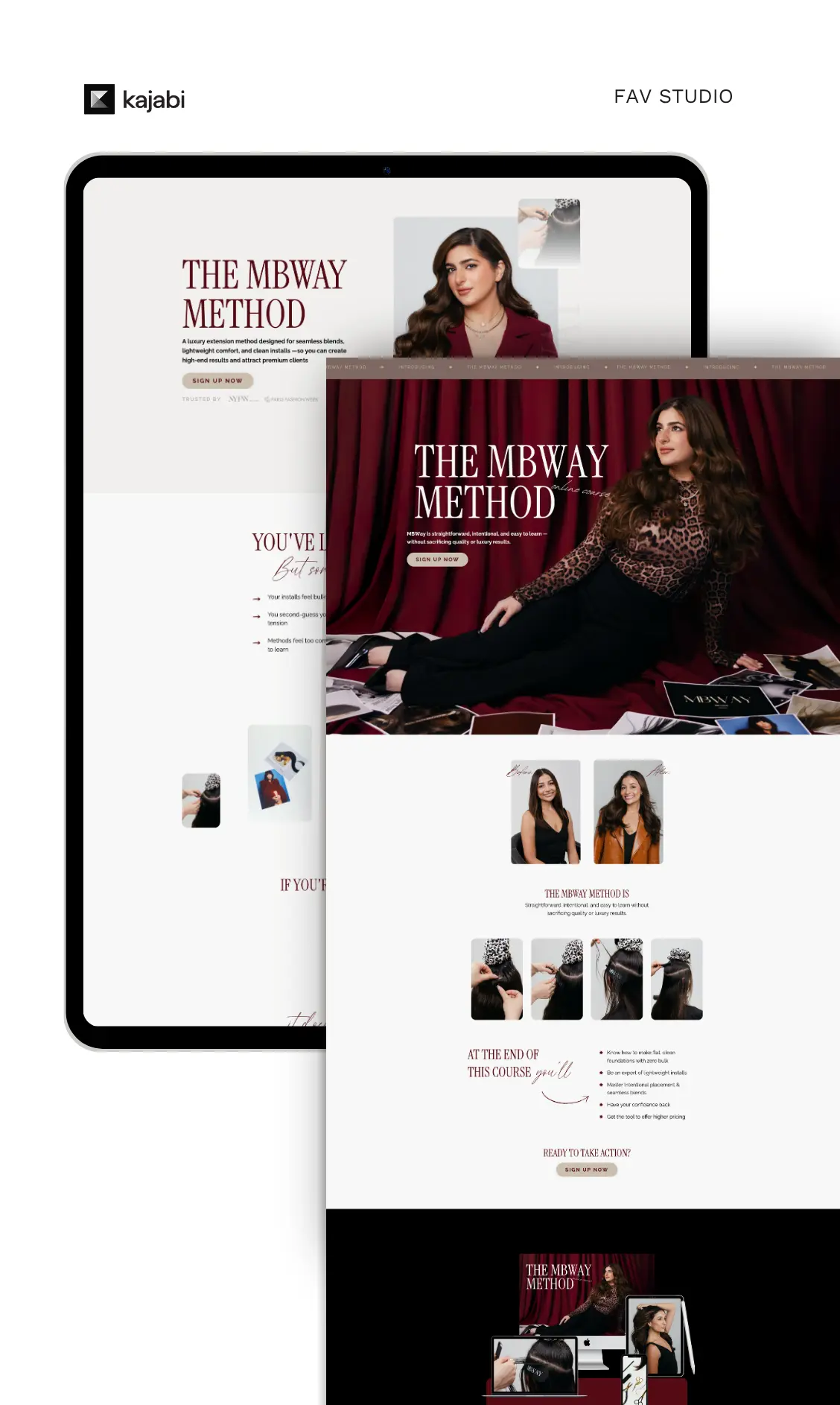
1: Mahshid — How an Online Course Page Sells Identity, Not Information
What it does right
Mahshid's page doesn't open with a module list. It opens with a mirror — the kind that shows you who you could become on the other side of the course. That's the entire game for online course creators. Your buyers aren't purchasing information. They're purchasing a version of themselves they can't get to alone.
The design is warm, consistent, and visually cohesive with her brand personality. There's no visual competition — no four different fonts, no stock photo energy, no cluttered sidebar. The primary CTA sits above the fold and reappears at natural scroll points without feeling desperate.
What most creators miss here
The instinct is to list everything you teach. More modules, more value, more content. But specificity beats comprehensiveness every time. The more clearly your page speaks to one person's exact situation, the higher it converts — even with less content on the page.
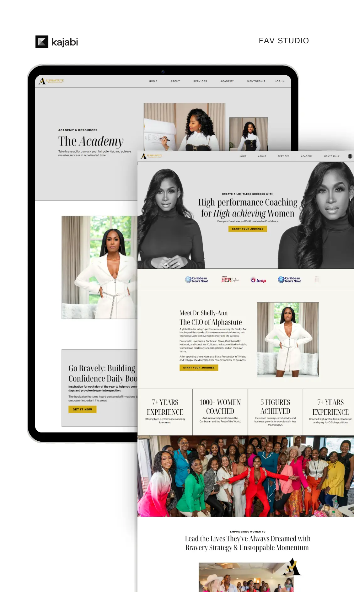
2: Alphastute — The Mentorship Page That Sells Access, Not a Curriculum
What it does right
This is one of the clearest kajabi sales page examples of authority-first conversion architecture. You land on the page and immediately understand: who this person is, who this program is for, and what students have already achieved. The testimonials aren't vague five-star reviews — they're outcome-specific wins that mirror exactly what the prospective buyer wants.
The page also handles scarcity intelligently. Not a fake countdown timer. Not manufactured urgency. Just honest positioning around the nature of a mentorship: limited seats, direct access, and real results that require both.
What most creators miss here
Mentorship pages that sell the curriculum underperform. Buyers aren't paying for a course — they're paying for proximity to you. Your page needs to make that proximity feel valuable, rare, and worth the investment. Alphastute gets this right from the first fold.
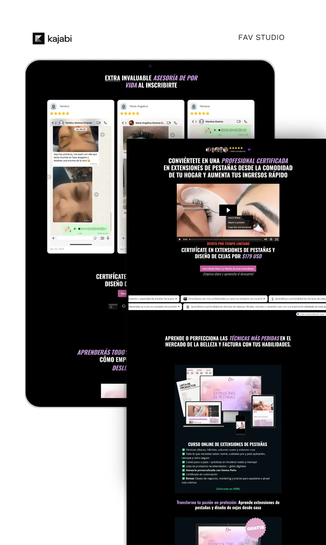
3: Etina Beauty Academy — When Kajabi Landing Page Design Does the Selling
What it does right
In beauty, your page is your product demo. Before a visitor reads a single headline, the design has already communicated your level of professionalism, taste, and attention to detail. Etina's page earns trust visually before it earns it verbally — and that sequencing matters enormously in visual industries.
This is one of the strongest kajabi landing page design examples for beauty, wellness, and lifestyle brands specifically because it doesn't try to over-explain. The page flows from aspiration to credibility to enrollment in a way that feels natural, not forced. The photography elevates the offer. The copy closes it.
What most creators miss here
Generic Kajabi templates with stock photography actively hurt beauty brands. Your page's aesthetic communicates your brand's standard before anyone reads your bio. If the page looks polished, people assume the course will be too. If it looks like everyone else's, they hesitate — no matter how exceptional your actual content is.
4: Ari Taulieb — The Coaching Page That Converts by Saying No to the Wrong People
What it does right
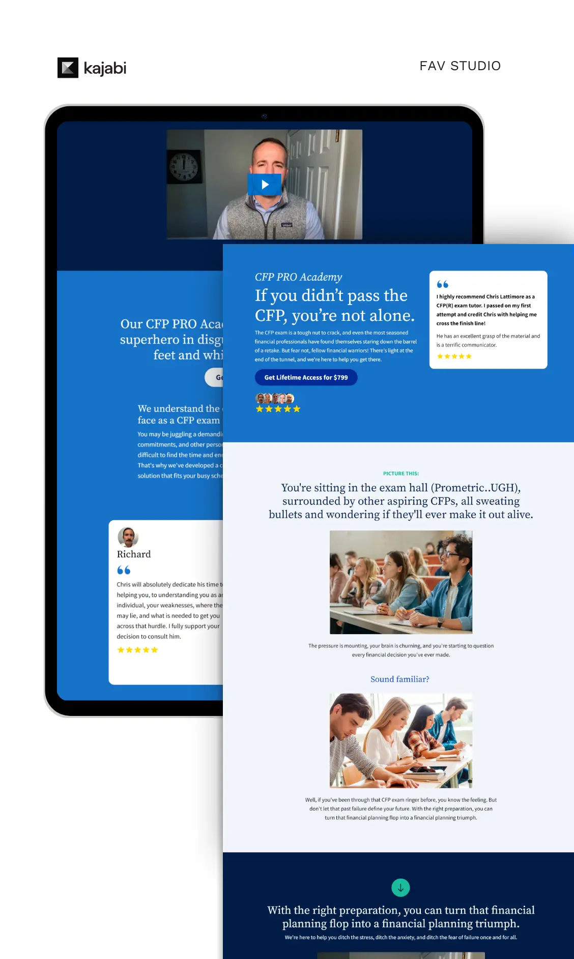
Most coaches are terrified to narrow their audience. Ari's page does it boldly — and that decisiveness is exactly what converts the right buyers.
The page makes crystal clear who this is for and, just as importantly, who it isn't. That kind of specificity reads as confidence. And confidence is the first quality people evaluate when they're considering hiring a coach. The page uses a problem-agitation-solution structure that feels editorial rather than salesy — you're being guided through a clear narrative, not pitched at.
By the time the CTA arrives, you've already been sold. Not by pressure. By accumulated trust.
What most creators miss here
Coaching pages that try to appeal to everyone convert poorly. The fear of excluding someone leads to language so broad it resonates with no one. The counterintuitive truth: the narrower your page speaks, the higher it converts, because the right person feels like you built it specifically for them.
5: Retreat Page — How to Sell an Experience Before You Sell the Details
What it does right
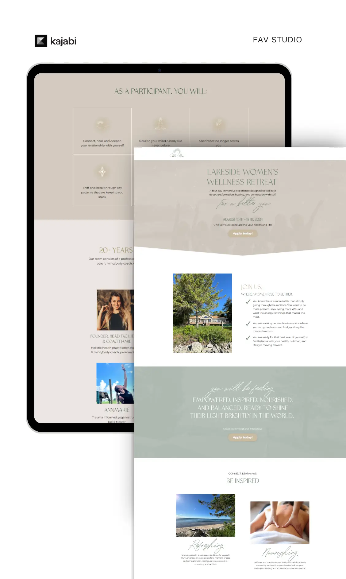
Retreat pages have one job above all others: make you feel something before you read anything. This page nails that. The language is sensory and emotionally resonant — you're not being handed an itinerary, you're being pulled into an atmosphere.
This is where most retreat and event pages break down. They lead with the what — dates, location, schedule, price — before they've established the why. Logic doesn't book retreats. Desire does. And desire has to come first.
The kajabi landing page design here also uses whitespace as a strategic tool. The breathing room gives visitors space to imagine themselves in the experience — which is exactly the emotional state you need them in before you ask them to check out.
What most creators miss here
High-ticket experiential offers require emotional investment before logical justification. If your retreat page opens with the agenda, you're selling in the wrong order. Sell the transformation first. Then give them the details to confirm the decision they've already made emotionally.
6: Language Course — The Kajabi Sales Page That Turns a Long Journey Into a Clear Path
What it does right
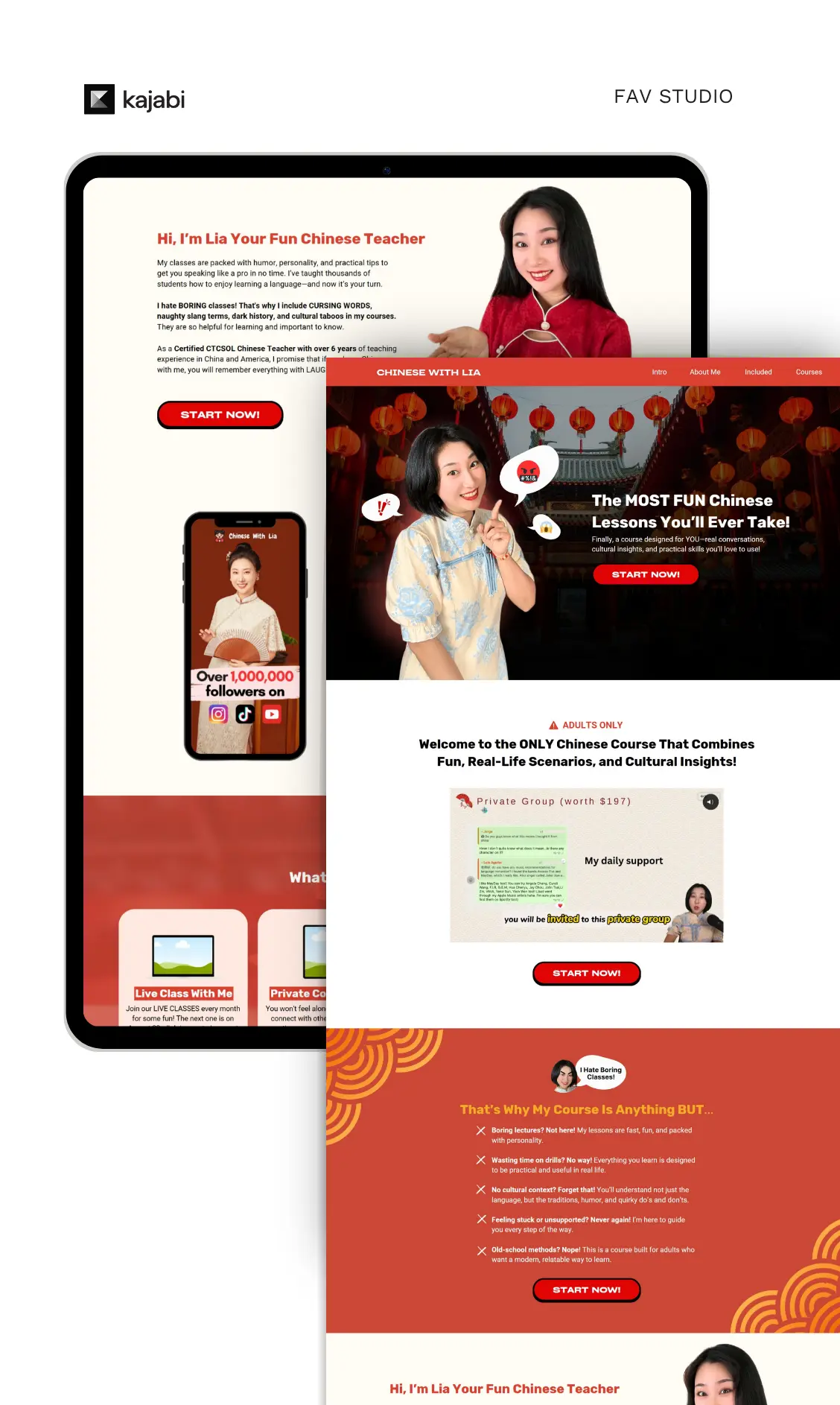
Language courses face a conversion challenge that most education products don't: the outcome is tangible, but the path to get there feels long and uncertain. This page solves that problem by making progress visible.
Instead of promising fluency in vague terms, the page breaks the transformation into milestones — concrete stages the student can see themselves moving through. That visibility makes the goal feel achievable, and achievable goals get purchased. The copy also handles objections with unusual sophistication: common hesitations (time, starting level, consistency) are addressed within the main narrative rather than siloed into a defensive FAQ block.
What most creators miss here
For education products with longer learning timelines, the sale often stalls not because of price, but because the transformation feels too far away. Progress visualization is an underused conversion tool. When people can see the milestones, the destination feels closer.
7: Corporate Event — Proof That Kajabi Landing Page Strategy Works Beyond the Creator Space
What it does right
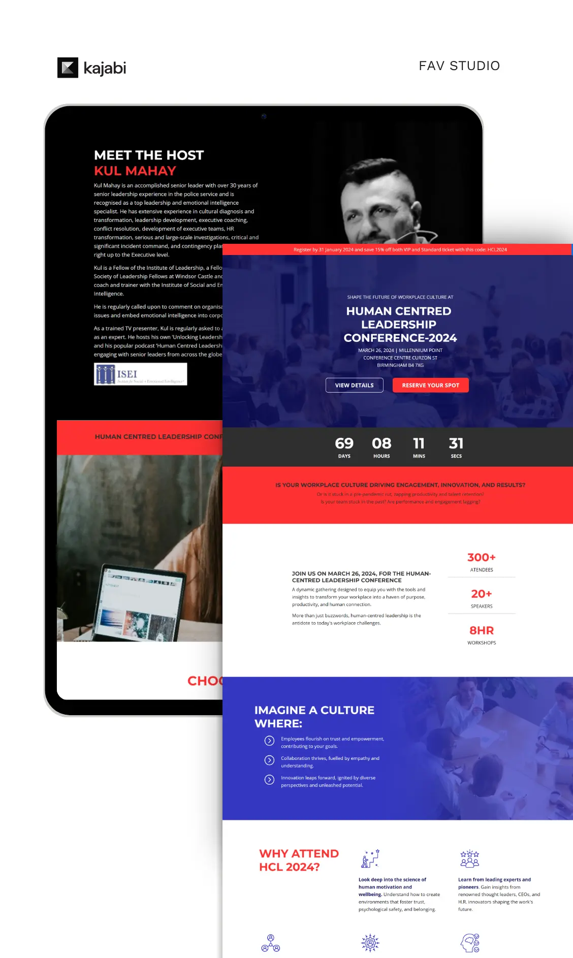
This one challenges a common assumption: that Kajabi is only for solo creators and coaches. This corporate event page proves otherwise — and it does so by applying the same conversion principles with a completely different tone.
The page opens with ROI-oriented language. It speaks to decision-makers who are evaluating the event against other priorities and competing demands on their team's time. Everything is specific: outcomes, speakers, logistics, registration flow. There's no ambiguity. No vague transformation language. Just clear deliverables, organized information, and an obvious next step.
What most creators miss here
B2B and corporate audiences don't respond to the same emotional triggers as individual buyers. They need precision, credibility, and clarity of outcome. If you're building a Kajabi page for a corporate or professional audience, match your language to their communication style — and make the path to registration completely frictionless.
The 5 Things Every High-Converting Kajabi Landing Page Gets Right
After breaking down pages across six different categories, here's what the best performers consistently share — in order of impact:
A specific above-the-fold message. No one scrolls to figure out what you're selling. The headline, subheadline, and primary CTA need to communicate who this is for and what they get — before the fold.
Emotion before logic. Desire is created by feeling, not features. The pages that convert fastest make visitors want the outcome before they explain how it works.
One primary CTA — repeated strategically. Not three buttons pointing different directions. One clear action, reintroduced at natural decision points as the reader scrolls.
Outcome-specific social proof. Not "This was amazing!" but "I went from X to Y in Z weeks." The more precisely the testimonial mirrors the prospective buyer's situation, the harder it works.
Design that earns trust before the copy does. Your page's visual quality communicates your standards before a single word lands. In 2025, a generic template is a liability.
FAQ: Kajabi Landing Pages
What makes a Kajabi landing page actually convert?
Clear positioning, conversion-aware copy, and design that reflects your brand's quality. The highest-converting pages lead with a specific transformation, back it with outcome-based proof, and make the next step obvious without friction.
Are Kajabi sales pages good for high-ticket offers?
Yes — when built strategically. High-ticket kajabi sales page examples like coaching academies and retreat pages require longer copy, stronger proof, and more intentional objection handling. The platform can handle it; the strategy has to be right.
How do I improve my Kajabi landing page design?
Start by auditing your above-the-fold section. Does someone landing cold immediately know who this is for and what they get? If not, that's your first fix. From there: tighten your CTA, upgrade your social proof, and make sure your design matches the quality of your offer.
What's the right length for a Kajabi landing page?
Long enough to answer every meaningful question a ready buyer would have — short enough to hold their attention throughout. High-ticket offers need more copy. Warm audiences or lower-ticket products can convert with less. There's no universal length — only the right length for your specific offer and audience temperature.
Do I need a designer to build a converting Kajabi page?
Not always, but strategy is non-negotiable. The biggest conversion gaps usually aren't design problems — they're positioning problems. If your message is sharp and your structure is sound, a clean Kajabi template can perform well. If your message is unclear, no design will save it.
Ready to apply these strategies to your own Kajabi landing pages? Start a project with us and build pages that truly convert.