4 UGC Portfolio Examples That Will Actually Help You Land Brand Deals
By Chrisianie Pacheco
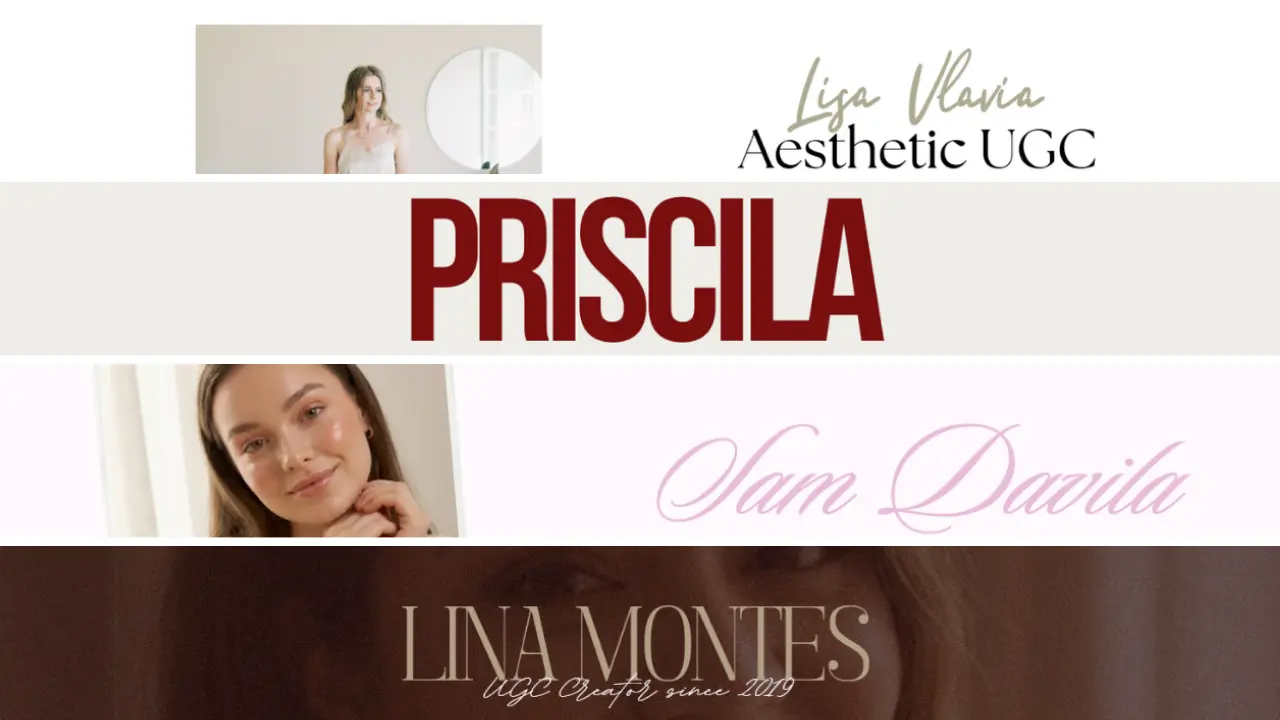
Here's the uncomfortable truth about UGC portfolio examples that most creator advice skips over: brands aren't looking for the most followers, the most experience, or even the most polished content. They're looking for the creator who makes them feel like working together is a no-brainer, and your portfolio is where that decision gets made.
A weak portfolio doesn't just fail to impress. It actively costs you deals. Brands move fast, their inboxes are full, and if your portfolio doesn't communicate your value in the first ten seconds of someone opening it, they're already onto the next one.
The good news? You don't need years of brand experience or a design background to build a UGC creator portfolio that converts. You need the right structure, the right presentation, and a clear sense of what you're bringing to the table. The four examples below show exactly what that looks like, and we've built the Canva templates behind each one so you can make it yours today.
What Brands Actually Look for When They Open a UGC Portfolio
Before the examples, this framing matters. A UGC portfolio isn't a highlight reel, it's a pitch document. And like any good pitch, it needs to answer three questions before the reader has to ask them: who are you, what kind of content do you make, and why should a brand trust you with their product?
Design plays a bigger role here than most new creators expect. Before a brand reads a single word of your bio or watches a single clip, the visual presentation of your portfolio has already told them something about your standards. A cluttered, inconsistent, or clearly templated-without-customization portfolio signals a creator who hasn't invested in their brand yet. A clean, cohesive, well-designed one signals someone worth the rate.
That's the standard every example below is built to.
1. Lisa: Clean Aesthetic UGC Portfolio Built for Lifestyle Brand Deals
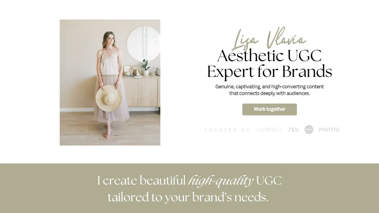
Lisa's portfolio is built for the creator who leads with aesthetics. The layout is clean, editorial, and immediately communicates taste, which is one of the first things a brand is evaluating when they're looking for a UGC creator to represent their product visually.
What makes this UGC portfolio example work isn't any single design element. It's the consistency. Every section, the hero, the about block, the content samples, the contact CTA, feels like it belongs to the same brand. That cohesion tells the brand reviewing it: this creator understands visual storytelling, and they'll apply that same eye to content made for us.
Why This Portfolio Style Works for Beauty and Lifestyle Brands
Beauty and lifestyle brands are exceptionally design-sensitive. They're not just buying content, they're buying a visual representation of their product in someone else's world. Lisa's layout speaks directly to that priority. The soft tones, the clean typography, and the editorial spacing all signal: I know how to make your product look good.
If your niche sits anywhere in the beauty, wellness, fashion, or lifestyle space, this is the portfolio format that makes brands feel like you already understand their aesthetic before you've even made a single piece of content for them.
What to Put in Your Lisa UGC Portfolio Template
The Lisa template is structured around five core sections: a hero introduction with your creator niche and value proposition, a brand collaboration showcase, a content sample grid, a short about section that sells your expertise without overselling, and a clear contact or booking CTA. Each section has a job, and together they move a brand from "who is this?" to "I want to work with them" without a single unnecessary element in between.
→ Get the Lisa Canva UGC Portfolio Template
2. Priscila: Bold Luxe UGC Portfolio Built for Beauty Creators
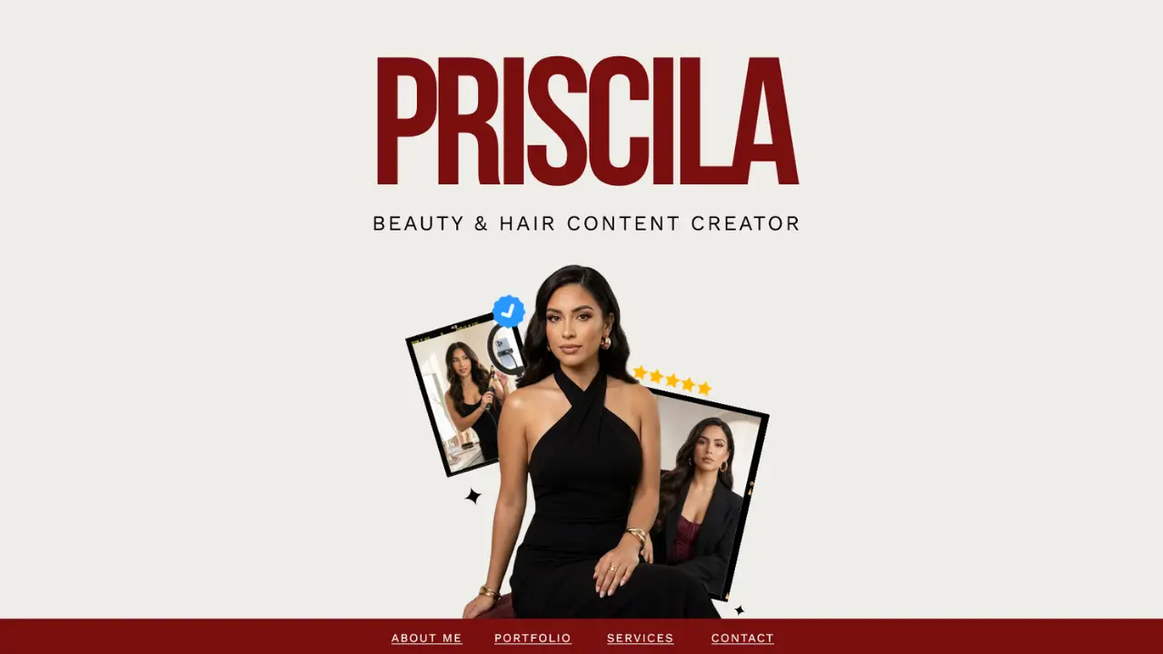
Priscila's portfolio isn't trying to blend in, and that's the entire point. In a space where most UGC creator portfolios look like variations of the same soft-toned, minimalist layout, a bold, high-contrast design is a pattern interrupt. It stops the scroll. It makes the brand pause. And in a crowded inbox, a pause is the first step toward a yes.
This UGC portfolio example is built for the creator who has a strong point of view and isn't afraid to show it. The layout is structured, confident, and visually commanding, without sacrificing the clarity that makes a portfolio actually useful to the person reviewing it.
The Strategy Behind a High-Contrast UGC Portfolio Design
Bold design works when it's backed by equally bold positioning. Priscila's template is designed to pair with a creator whose niche, content style, and brand voice are just as defined as the layout itself. If you're a creator who makes high-energy content, speaks to a specific and engaged community, or works in categories like fitness, food, or entertainment, this is the format that matches your energy and signals it to brands immediately.
The risk with a bold portfolio is looking chaotic rather than confident. This template avoids that by keeping the structure tight and the typography intentional, so the boldness reads as a brand decision, not a design accident.
How Priscila's Layout Handles Social Proof
One of the strongest features of this UGC portfolio template is how it integrates social proof without making it the centerpiece. Brand logos, collaboration callouts, and content metrics are woven into the layout rather than stacked in a separate "brands I've worked with" section that feels like an afterthought. That integration makes the portfolio feel more like a brand story than a résumé. Which is exactly the register you want when you're pitching to brands who think in campaigns, not CVs.
→ Get the Priscila Canva UGC Portfolio Template
3. Sam: Feminine Minimalist UGC Portfolio for Influencers
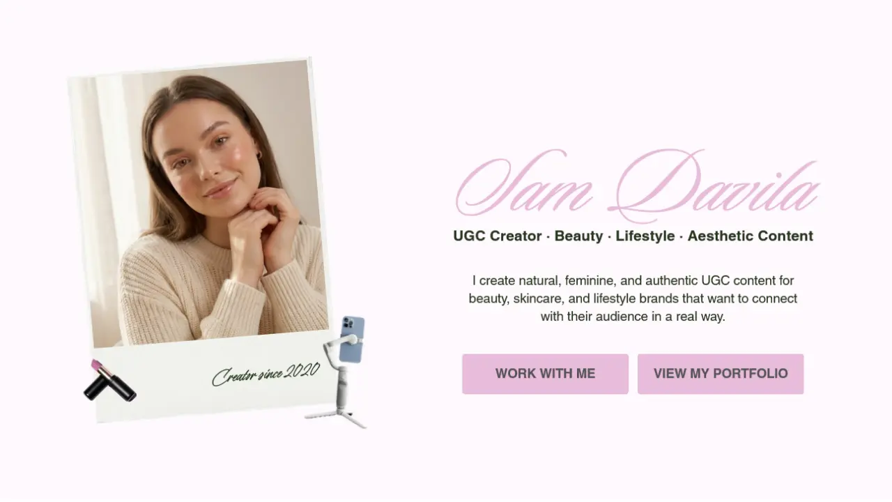

Sam's portfolio is for the creator who knows that the best design is the kind that gets out of the way. The layout is clean, minimal, and entirely focused on one thing: making it as easy as possible for a brand to see your content, understand your value, and take the next step.
This is what a strong Canva UGC portfolio looks like when conversion is the priority over aesthetics. Every section is stripped back to exactly what's needed, no decorative clutter, no unnecessary copy, no design elements that distract from the content samples themselves. The result is a portfolio that feels polished, professional, and completely focused.
Why Minimalism Is a Power Move in UGC Portfolios
There's a temptation when building a UGC creator portfolio to fill every section, more content samples, more brand logos, more testimonials, more information. The logic feels sound: more proof, more persuasion. But the brands reviewing the most portfolios aren't looking for the most information. They're looking for the clearest signal.
Sam's template understands that restraint is a form of confidence. A portfolio that shows ten carefully chosen content samples in a clean, well-spaced grid is more persuasive than one that shows thirty pieces in a cluttered layout, because curation signals judgment, and brands want to work with creators who have it.
Who This UGC Portfolio Template Is Built For
Sam's layout works particularly well for creators who are newer to UGC and want a portfolio that looks established without overclaiming. The clean structure means the focus stays entirely on the content, which is exactly where it should be when you're letting the work build the case. It's also a strong choice for creators pitching to corporate, tech, or wellness brands where a clean, professional aesthetic is more aligned than something bold or editorial.
→ Get the Sam Canva UGC Portfolio Template
4. Lina: Soft Aesthetic UGC Portfolio for Lifestyle & Wellness
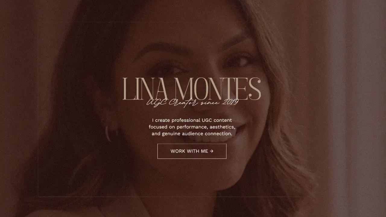
Lina's portfolio is built on a different philosophy than the others in this list, and that's intentional. Where Lisa leads with aesthetic, Priscila leads with boldness, and Sam leads with clarity, Lina leads with connection. The layout is warm, personal, and structured around a creator's story as much as their content samples.
This UGC example format works because some brands aren't just buying content. They're buying a creator whose audience trusts them, whose personality aligns with their product, and whose story makes the endorsement feel genuine rather than transactional.
Why Your Story Is a Conversion Tool, Not Just a Bio
Most UGC creator portfolios treat the about section like a formality, a few lines of background information sandwiched between the content grid and the contact form. Lina's template repositions it as a strategic asset. The about section is placed early, written with intention, and designed to create an immediate sense of who this creator is and why a brand would want their product in their hands.
This matters most for creators whose value proposition is tied to a specific lifestyle, community, or personal brand. If the reason brands should work with you is partly you, your voice, your audience relationship, your niche credibility, then your portfolio needs to make that case explicitly. Lina's layout is built to do exactly that.
The Brands That Respond Best to This Portfolio Style
Warm, story-led portfolios like Lina's tend to perform best with brands in the wellness, motherhood, home, food, and sustainable lifestyle categories, spaces where the creator-audience relationship is part of the product pitch. If you're pitching to brands whose customers make decisions based on trust and relatability rather than trend or aesthetics alone, this is the format that speaks their language.
→ Get the Lina Canva UGC Portfolio Template
The Non-Negotiables Every UGC Portfolio Needs, Regardless of Which Style You Choose
Four different layouts, four different brand personalities, four different target brand types, and yet the same core elements show up in every strong UGC portfolio example. These aren't optional extras. They're the foundation that makes any portfolio format work.
A clear niche statement above the fold. Brands shouldn't have to guess what kind of content you make or who your audience is. State it clearly, early, and specifically. "Lifestyle UGC creator" is less useful than "UGC creator for wellness and clean beauty brands." The more specific, the better.
Content samples that show range within your niche. Not ten videos of the same format. A mix that shows you can do unboxing, testimonial, tutorial, and lifestyle integration, all within the same content category. Brands want to know you're versatile enough to execute their brief, not just replicate the one thing you've practiced.
A rate card or starting price signal. You don't have to publish your full rate card in your portfolio. But giving brands a starting point, filters out misaligned inquiries and signals that you're running a professional operation, not just testing the waters.
A single, clear call to action. Not three contact options, not a link to your Instagram and your email and your booking form. One primary action whether that's booking a discovery call, filling out a collaboration form, or sending an email presented clearly at the end of the portfolio.
Consistent visual branding throughout. Your fonts, colors, and image treatment should feel deliberate and cohesive from the first page to the last. Inconsistency reads as unfinished. Cohesion reads as professional. The difference between the two is the difference between a brand bookmarking your portfolio and closing the tab.
FAQ: UGC Portfolio Questions Creators Actually Ask
What Should I Include in a UGC Portfolio With No Brand Experience?
Start with spec work content you've created for brands without a paid partnership. Buy a product you love, create three to five pieces of high-quality UGC for it, and include those in your portfolio with a note that they're concept pieces. Brands care about the quality of the content and your ability to execute a brief, not whether you had a contract behind each piece. A strong spec portfolio will outperform a weak paid one every time.
How Long Should a UGC Creator Portfolio Be?
Short enough to hold attention, long enough to answer the key questions. In practice, that means five to eight pages or sections: a hero introduction, a brief about section, three to six content samples, a brand or collaboration section if applicable, a services or rate signal, and a clear CTA. Anything beyond that risks losing the brand before they reach your contact information.
Should My UGC Portfolio Be a PDF or a Website?
Both work and the best UGC creator portfolios often use both for different purposes. A Canva UGC portfolio exported as a PDF is easy to attach to a pitch email and quick for a brand to review without clicking through to an external link. A website-based portfolio works better for inbound discovery when brands are finding you rather than you pitching them. Starting with a well-designed PDF and building toward a website version as your business grows is the most practical approach for most creators.
How Do I Make My UGC Portfolio Stand Out?
Specificity and design. Most UGC portfolios are generic because the creators behind them are trying to appeal to every brand in every category. The ones that stand out have a clear niche, a defined visual identity, and content samples that speak directly to the kind of brand they want to work with. Add strong design which is exactly what the Canva UGC portfolio templates above are built to deliver and you have a portfolio that's memorable before a brand has finished their first scroll.
Can I Use Canva to Build a Professional UGC Portfolio?
Absolutely and the results can be genuinely impressive when the template is designed with strategy in mind rather than just aesthetics. The four Canva UGC portfolio templates in this post were built specifically for creators who want a professional, brand-ready portfolio without needing a designer or a developer. Each one is fully editable, export-ready as a PDF or presentation, and designed to convert brand attention into actual collaboration inquiries.
Your Portfolio Is the First Deal You Close Make It Count
Every brand deal you want starts with a brand opening your portfolio and deciding in the next thirty seconds whether you're worth their time and budget. That decision is made on design, clarity, and the immediate sense that you know what you're doing long before they've watched a single video or read a single line of your bio.
The four UGC portfolio examples in this post aren't just inspiration. They're a blueprint and we've built the Canva templates behind each one so that the gap between "I need a better portfolio" and "my portfolio is done" is as small as possible.
Pick the layout that fits your brand. Customize it with your content, your niche, and your voice. And then send it to the brands you actually want to work with, with the confidence that your portfolio is doing its job before you say a single word.
Ready to level up your online presence? Start a project with us today.