Website Design for Coaches: 7 Essentials to Attract More Clients
By Chrisianie Pacheco

You post consistently. People DM you “this was so helpful.” But your discovery call calendar is still mostly empty.
That gap usually isn’t your coaching, your content, or your audience. It’s your website. Website design for coaches has one job: take someone who kind of trusts you from Instagram, a podcast, or a referral, and give them a clear, confident reason to book.
Most coaching sites do the opposite. They introduce you. They list your certifications. They say “I help people unlock their potential.” And a ready-to-buy visitor leaves to think about it.
Here are the 7 essentials we build into every coaching site at Fav Studio, written for coaches who sell 1:1 programs, group containers, and high-touch packages.
What Your Ideal Client Is Really Thinking When They Land on Your Coaching Website
Good website design for coaches starts with the visitor’s inner monologue. Someone considering a coach is spending real money to fix something personal. They’re nervous, a little skeptical, and often comparing you to two other coaches in another tab.
Within seconds, they’re silently asking:
- “Is she talking about me?” (Do I see my exact situation?)
- “Has she done this for someone like me?” (Where’s the proof?)
- “What happens if I book?” (Is the next step clear and low-pressure?)
If your homepage can’t answer those three questions without scrolling, you’re losing the warmest leads you have. Everything below is built around answering them.
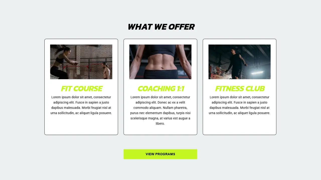
Essential 1: A Niche Headline That Makes the Right Client Say “That’s Me”
The best coaching website design starts with words. Your headline is not the place for your mission statement. It’s where you name who you coach, what they’re stuck on, and what changes.
Compare these:
- Generic: “Helping you become the best version of yourself.”
- Specific: “Executive coaching for first-time directors who are tired of being the most overworked person on the team.”
- Specific: “Postpartum fitness coaching for moms who want strength back without another 6am program.”
The specific versions feel almost uncomfortable to write, because they exclude people. That’s exactly why they work.
A pattern we see often: a coach rewrites a broad “mindset and wellness” hero into one audience and one problem. Inquiries tend to improve in quality first, then quantity. People stop saying “I’m not sure if you can help me” and start saying “I’m exactly who you described.”
Essential 2: A Homepage Built to Get Discovery Calls, Not Compliments
A website for coaches should walk a stranger toward a conversation with you. Order beats decoration.
Here’s the sequence we use:
- Hero: your niche headline, one supporting line, one button
- Their problem: describe their Tuesday-night 11pm thoughts so well they feel seen
- Your method: a named 3-step process (it makes your coaching feel tangible)
- Client results: real quotes, before-and-afters, outcomes
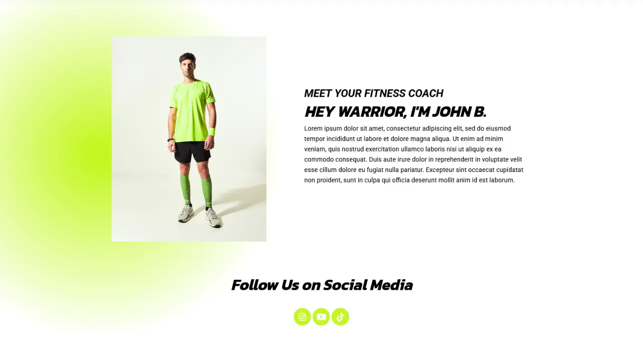
- About you: short, and told through why you coach this person
- Final CTA: repeat the call to book
Pick one booking action
“Book a free call,” “Take the quiz,” “Join the waitlist,” “Download the guide,” all on one page is a menu, not a path. Choose one primary action. Send everything else to secondary spots.
Keep your About section short
Your About page is the second most visited page on most coaching sites, but your homepage About section should be three to five sentences. Connect your story to the client’s problem, then link to the full page.
Essential 3: Testimonials and Coach Website Examples of Proof That Actually Convert
Study any high-performing coach website example in our case studies and you’ll notice proof isn’t tucked away on a testimonials page. It’s sitting next to every button.
Coaching is an intangible purchase. Your proof has to make it tangible:
- Transformation, not praise: “Amazing coach!” does little. “I went from dreading Mondays to negotiating a promotion in 4 months” sells.
- Before and after language: Where were they stuck? What shifted?
- Names, photos, or voice notes: Use them whenever clients consent.
- Credentials, kept light: ICF or other certifications build confidence, but results persuade more than letters.
Place proof at the point of hesitation
Put a short testimonial directly beside your “Book a Call” button. That’s where doubt peaks.
Brand new coach with no testimonials?
Run two or three pilot clients at a reduced rate in exchange for a detailed written or video testimonial. Ask three questions: what were you struggling with, what changed, and who would you recommend this to? Three specific stories beat ten vague ones.
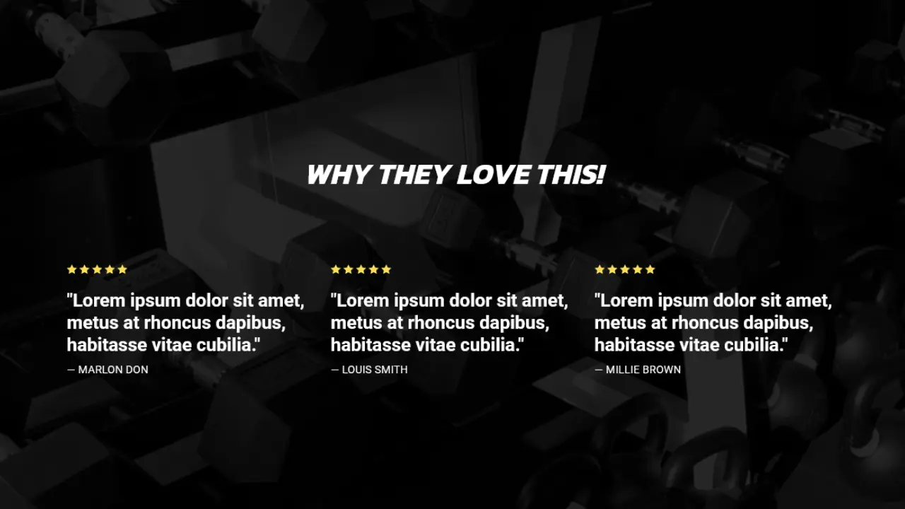
Essential 4: A “Work With Me” Page That Makes Your Packages Easy to Choose
Vague offers stall otherwise ready clients. Strong coaching website design makes your packages clear enough that someone can decide, or at least know exactly what to ask on the call.
For each program, show:
- Outcome-based name: “The 90-Day Leadership Reset” beats “Premium Package”
- Who it’s for: (and who it isn’t)
- What’s included: number of sessions, Voxer or Slack access, workbooks, calls
- Timeline: 8 weeks, 3 months, 6 months
- One next step: apply or book
Should coaches list prices on their website?
It depends on your model. If you sell high-ticket 1:1 coaching, a “from” range or an application form filters for fit and protects your calendar. If you sell group programs or courses, show the price. Hidden pricing on lower-ticket offers just adds friction.
Free call or application?
If you’re getting unqualified calls or no-shows, add a short application before the booking link. Three to five questions (goals, current situation, investment readiness) is plenty. It signals that your time has value.
Essential 5: Coaching Website Design That Looks Like Your Rates
Visual design in website design for coaches is a pricing signal. A $3,000 program sold from a cluttered template creates a quiet mismatch. Clients feel it even if they can’t name it.
What matters most:
- Two or three brand colors used consistently
- One heading font, one body font
- White space. Calm design suggests a calm, grounded coach
- Real photos of you coaching, speaking, or working, not just stock images
- Mobile-first layout, because most of your visitors tap through from Instagram or TikTok
Match the design to the transformation you sell. A burnout coach’s site should feel spacious and steady. A performance coach’s site can feel bold and high-contrast. Your site is the first proof of your method.
Essential 6: SEO for Coaches So Clients Find You Without Chasing Content Every Day
If your entire pipeline depends on posting daily, you have a content treadmill, not a business system. SEO is how a website for coaches keeps bringing in warm leads while you’re in sessions.
The basics:
- One topic per page with its own title tag and meta description
- Headings that mirror real searches from your ideal client
- Descriptive image file names and alt text
- Fast loading, clean URLs
- A blog or resource hub answering real client questions
Write for the problem, not the job title
Nobody searches for “executive coach.” They search “how to manage a team that used to be my peers” or “why am I exhausted after every promotion.” Build content around the moment of frustration. Coaching becomes the natural next step.
Add a location or niche angle
“Career coach for women in tech” or “health coach in Miami, Florida” is easier to rank for than “coach.” Specific beats broad in search too.
Essential 7: A Booking and Follow-Up Flow That Handles Leads While You Coach
The last piece of coaching website design is what happens after someone clicks. Most coaches stop at “here’s my Calendly,” and lose to everyone who isn’t ready that day.
Build a simple system:
- Primary path: booking page with a short intake or application
- Confirmation page: what to expect, who you are, how to prepare (this reduces no-shows)
- Reminder emails: short, warm, with a reschedule link
- Secondary path: a free guide, quiz, or email series for the “not yet” visitors
- Follow-up sequence: 3 to 5 emails that share a client story, your method, and an invitation to book
Don’t ignore the “not yet” visitors
Most people need several touchpoints before they invest in coaching. An email list lets them keep warming up while you stay top of mind.
At Fav Studio, our services build the site, content, and funnel as one connected system, so every visitor, from a first-time Instagram click to a returning lead, has a clear next step.
Mistakes That Quietly Cost Coaches Clients (and How to Fix Them)
After looking at a lot of coaching sites, the same patterns repeat:
- “I help everyone grow.” Fix: choose one client type and one problem.
- Your credentials lead the page. Fix: lead with their problem, then add credentials as proof.
- Booking link buried in the footer. Fix: add it to the hero, mid-page, and end.
- Testimonials with no specifics. Fix: collect transformation stories using three simple questions.
- No plan for people who aren’t ready to book. Fix: add a lead magnet and email sequence.
- Too many offers. Fix: feature one signature offer, then list the rest below.
Most of these are positioning fixes, not redesigns. Which is good news, because it means your current site may be closer than you think.
Frequently Asked Questions About Website Design for Coaches
What pages does a coaching website need?
At minimum: Home, About, Work With Me (offers), Results or Testimonials, Contact or Book a Call, and a Blog or Resources page.
What makes a good website for coaches?
A specific niche, strong proof, clear offers, and one obvious next step. Design supports all four, but clarity does the heavy lifting.
Where can I find coach website examples for inspiration?
Look at established coaches in adjacent niches, not just your own. Note their headline clarity, where they place testimonials, and how they structure the booking flow. Borrow the structure, not the words.
Do coaches need a blog?
Not required, but powerful. A blog answering your ideal client’s real questions is one of the most reliable ways to build trust and search traffic over time.
How long should a coaching website take to build?
A lean DIY version can take a weekend. A strategic custom build usually takes several weeks once copy, photography, and SEO are included.
Ready to Turn Your Website Into Your Best Discovery Call Source?
A strong coaching website doesn’t just look polished. It tells the right client they’re in the right place, shows proof you can help, and makes booking feel easy.
If you’d like a site built around your niche, your signature offer, and a booking flow that fills your calendar with qualified calls, we’d love to build it with you. Ready to turn your coaching expertise into visibility and booked clients? Reach out to start a project with us today.